Babe Ruth once said, “Hero’s get remembered but Legends never die.†We like to refer to that as our logo – well the legend of our logo that is.
It was a nice evening after work back in 1992 and seven young guys were sitting at a bar (that’s how all great stories start right)? They were discussing the usuals – life, liberty and the delicious taste of beer, but that special night, there was more. They were meeting to figure out how they could raise money for Chicago Special Olympics (our first charity) and put their connections to good use. It was then when the “magic†began. Hugh “the most uncreative board member†McLaughlin who typically struggled to draw a stick figure started doodling on a napkin. He mystically started sketching a golf ball and a stick golf flag. Meanwhile, some of the guys were too focused on coming up with event ideas and themes to actually see Hugh’s work. The guys who bore witness to Hugh’s work that night swear it must have been “divine intervention†— and so the legend began. To the board member’s surprise, they looked at the drawing and were awe struck. “At that point I raised my beer,†Hugh laughs, “and said cheers; let’s have one for the kids.†And that was that. One beer transformed into a stellar logo with the help of board member Mike Magnusson who worked with the artists at his ad agency, Pinnacle Advertising, to formalize Hugh’s vision. The logo is now a great source of pride and commitment for our 28 board members who have channeled this inspiration to raise almost a million dollars for partner charities in Chicago.
The fact that our logo started as a drawing on a cocktail napkin is a quintessential One for the Kids lore and highlights our mantra of “a great time for a great cause.†What happened to that precious napkin you ask? I dare not guess. However a replica was created and framed and is ceremoniously given to the incoming chairman of each event.
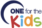
Like many great brands, logos go through tweaks, turns, and transitions in order to stay up with the times. We pride ourselves on the success we have had as a group and that success has brought other opportunities, like our cocktail party. We wanted our logo to represent the breadth of our overall organization given that these days we do more than just a golf outing. The newest version of our logo is a more colorful and fun design that we think represents our group perfectly. Board members Joe Chura (Owner of Launch Digital Marketing) and Tom Doyle (Owner of Accurate Printing) developed the new logo.
We have come such a long way since seven guys were sitting in a bar having a “cold one for the kids.†Logos say a lot about a brand. The story of the OFTK and the logo itself both highlight two long time beliefs of our group — camaraderie and “a great time for a great cause!†Bravo Hugh, long live the legend of the logo!
Our Logo Line Up
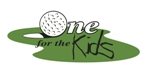 The original after the help of a design artist
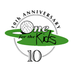 Used in 2002 for our 10th Anniversary
 Used in 2012 for our 20th Anniversary
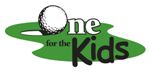 Used after our 20th Anniversary
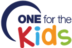 Newest legend to the group started in April 2014